DocRx
DocRx, Inc.
DocRx, a nationwide healthcare company, came to us needing a brand that looked as credible and forward-thinking as the services behind it. We delivered a refreshed visual identity, including a modernized color palette, redesigned print collateral, and clarified messaging that repositions DocRx as both a trusted clinical partner and a tech-forward leader.
Overview
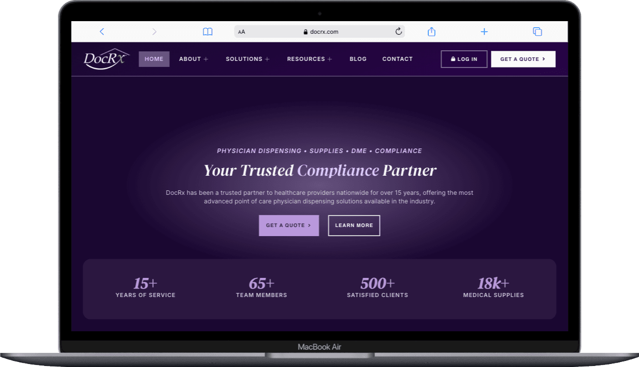
We partnered with DocRx on a brand refresh built to elevate the company's identity across print and digital touchpoints without losing the recognition it had already earned. Rather than a full rebrand, our team modernized and unified the existing system, sharpening the palette, the collateral, and the messaging so the brand could keep pace with an expanding lineup of services. We also designed the refreshed identity to set a clear foundation for a future website and a broader marketing rollout.
Context
DocRx operates across clinical, retail, and mail-order environments, supporting physicians, pharmacies, and care teams with point-of-care dispensing, medical supplies, and ancillary programs. As the company's services grew, its existing brand no longer reflected the sophistication or scope of the business. We saw the opportunity to bring the identity up to the level of the organization it represented, so it could signal clinical trust and technical credibility at the same time to the providers and partners who depend on it.
Challenge
Our core challenge was to modernize an established brand without discarding the recognition already tied to it. The identity had to feel more polished and credible while still reading as unmistakably DocRx. It also needed to hold together across a widening range of services and touchpoints, and to strike a balance many healthcare brands miss: looking innovative and technology-forward while staying trustworthy and compliant.
Goals
Refresh the existing color palette without abandoning brand recognition
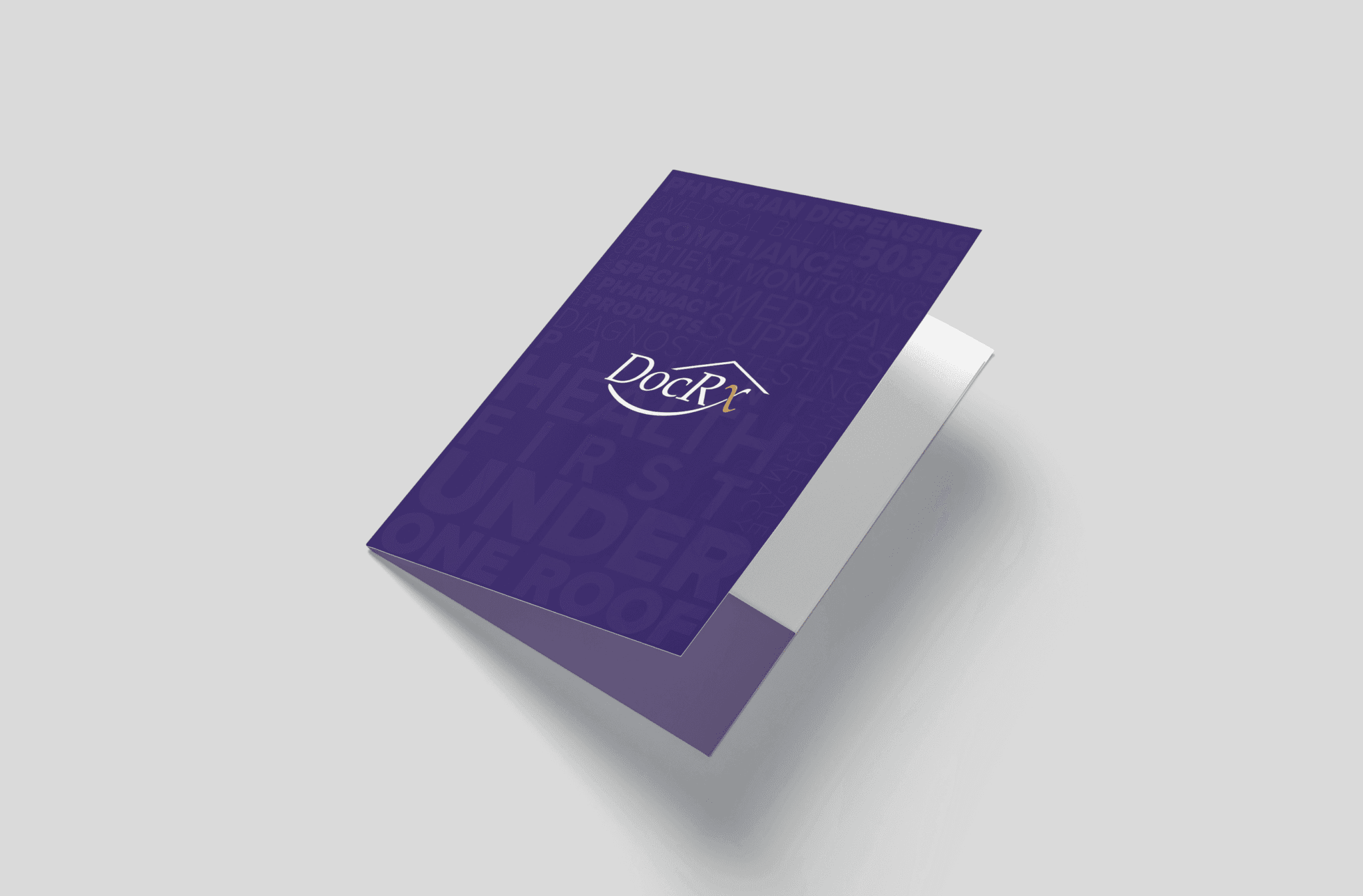
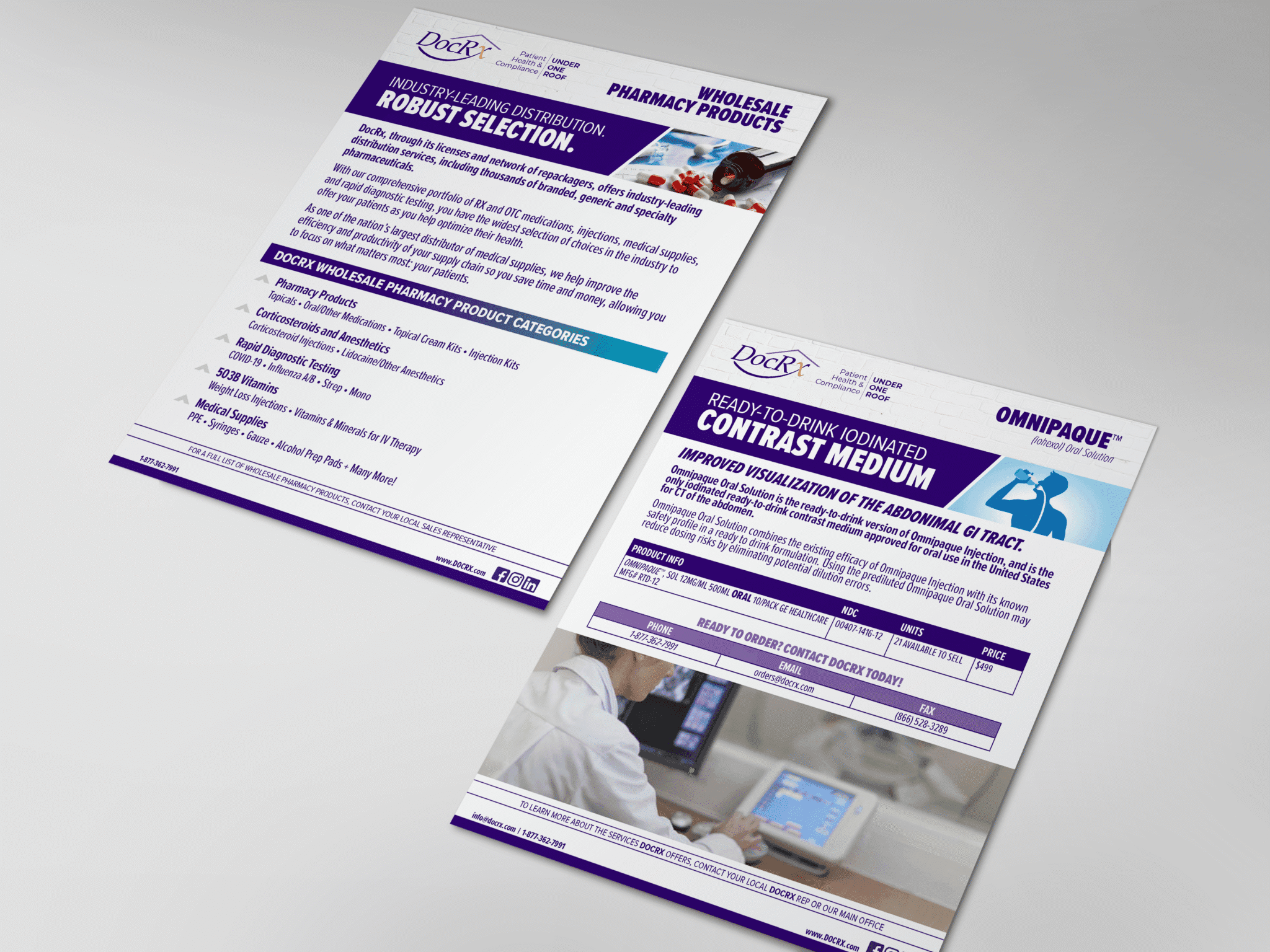
Redesign core print assets and business cards
Clarify brand messaging for healthcare providers and partners
Establish a design direction to guide a future website and marketing assets
Solution
We built the refreshed system around an enhanced palette of deeper purples and clean, high-contrast accents, chosen to communicate credibility and innovation while preserving the brand's familiar character. We redesigned the business cards and print collateral around the updated look, and refined the brand's messaging for consistent use across both print and digital. To keep the momentum going, we also delivered design strategy recommendations to carry the new identity into the company's website and future marketing.
Project gallery